

brand design
Custom brand design for Wild Flora, a flower farm offering event florals, “you-pick” flower events, and workshops.

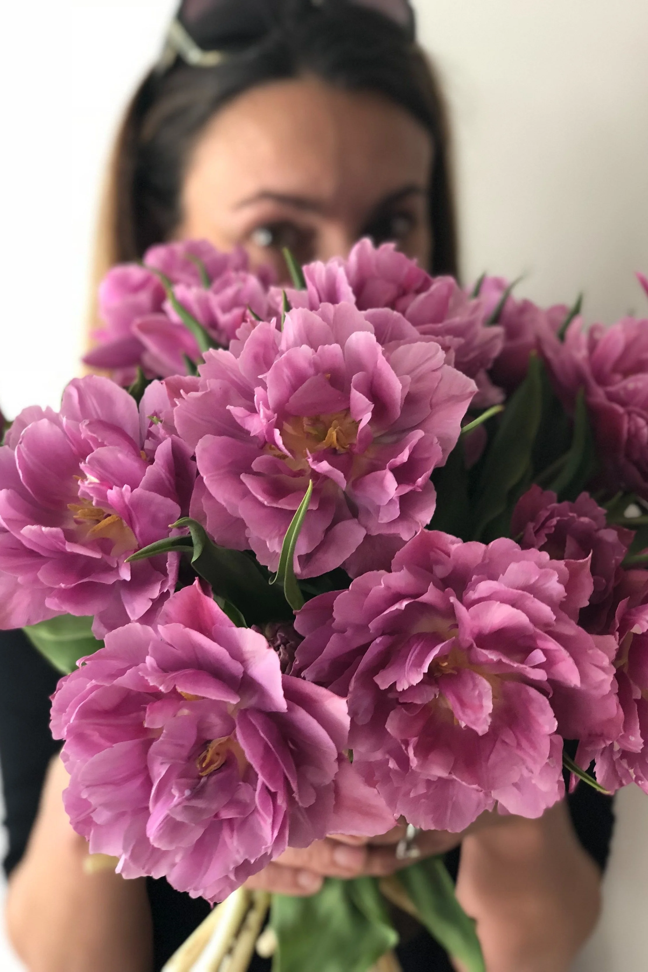
Wild Flora Farm is a flower farm offering custom-designed event flowers and workshops.
With a sister brand consisting of a beautiful newly-renovated 1864 barn venue, the company offers it all. Founder Kara Brewer came to us looking for a brand identity for Wild Flora, the flower design studio portion of the business.

What we did
Brand research & strategy
Creative brief
Custom logo and hand drawn icon
Brandboard with 4 main logo configurations, 2 icons, 2 wordmarks, 2 co-branding logos
9 custom illustrated icons
2 patterns
Website mockup
Hang sign
Highlight covers

We focused on a few main objectives.
The new Wild Flora brand needed to be new and fresh, work for all facets of the business, and stay true to the company roots.

The Wild Flora brand in real life


Objective 1
Create something new and fresh
We dove into font exploration aiming to find something that felt modern but classic at the same time.
We landed on a rich, bold serif that draws the eyes and makes for a memorable brand. In the logo configurations, the serif is paired with a simple and sleek sans and is made complete with an interlocking “FW” brand mark. We tied this together with The Barn of Chapel Hill logo by giving it an upgrade, swapping the existing fonts to that same serif. Now, the two brands look aligned but also stand apart on their own.

Objective 2
Design something that works for all facets of business
With so many services, it was important to Kara that the new branding worked for all parts: floral design, workshops, social media, and even products and collateral.
We handed off 4 main logo configurations, 2 icons, 2 wordmarks, 2 co-branding logos, 9 custom illustrations, and 2 patterns. With these brand elements at her fingertips, Kara has multiple logo options to use for everything from branded business cards and company tees to tissue paper and honey jar labels.

Objective 3
Stay true to the company roots
Wild Flora is a Carolina business through-and-through, and we played respect to this by using the classic Carolina Blue shade as the brand’s main color.
This is an aspect present in the existing brand that Kara wanted to maintain in the revamp. We were sure to keep it, and we paired it with a muted black, bright white, lighter blue, and light gray for a complete palette that tells the Wild Flora story and works beautifully throughout their brand. To pull in some color, the patterns and flower illustrations include shades of pink, red, orange, yellow, and green!
FOUNDER
Meet Kara
Founder, Wild Flora & the barn at chapel hill
“Everything is STUNNING. Seriously, Kathryn, I don't even have the words to adequately express how you exactly captured the brand so perfectly (while at the same time making sure the Barn's branding would still align!). It's perfection.
The style, balance, and movement of the Wild Flora logo/mark is gorgeous; I just love it. And the flower patterns/illustrations adds just the right touch of elegance, color and whimsy.....I love ALL of the business cards, stationery and especially the tissue paper/fabric with how perfectly both the illustrations and the Wild Flora logo works in a repeating pattern.”

full brand & web design
Glow
Bar
We worked with Gainesville-based MedSpa & IV Lounge, Glow Bar, to create a cohesive brand system and complete, custom-coded website.