Choosing the Perfect Palette for Your Brand and Website: 7 Key Considerations
What do you need to know to pick your brand & website colors? You're looking for how to choose brand colors for your business because you know how important it is to set the tone and vibe of your brand with color. Want to find a fail-proof formula to make sure you have the right colors for your brand? This in-depth guide is for you! In this article, we dive into seven things to consider when choosing your brand colors and give you our formula for brand colors you can follow.
The importance of color for your business
Color mistakes for a business can be costly. Choosing colors that present printing challenges can send a whole stack of business cards or even products to the bin! Not to mention colors that repel customers rather than attract them within your market. While color might at first seem to be a matter of “pretty,” it’s a decision for purpose and profit. Color can impact your bottom line.
So, before you go thinking picking the colors for your business is something you can do on a whim, there are several important things to factor into this process.
Our boutique agency has been in business for over 10 years. We’ve selected myriads of color palettes for clients in that time, and we know a thing or two about what businesses should consider when it comes to picking their brand colors.
Wondering how to pick brand colors for your business?
Color selection can be confusing! Do you need just one brand color? Should you have two colors? Three colors? What about brands that have multiple colors? And, wait, do these colors even go together?
Colors can feel like a mystery. What makes one color objectively better than another for your business? If there aren’t any bad emotions, then, there can’t be bad colors…can there?
Color can feel like a personal preference. But picking colors for your brand isn’t the same as pulling your favorite crayon from the box in preschool. Of course, there are colors you love to wear on your clothing or be surrounded by in your home. But, that doesn’t mean those are the right hues for your business.
How can you know what colors to use for your business and which to avoid? Is there a formula you can follow? Based on working with hundreds of clients, we say YES! We have secrets to how we select colors and we’re going to share them with you.
And if you already have branding, but are worried the colors aren’t in alignment with your goals, you can read our tips on signs it’s time for a rebrand.
Our in-depth guide to choosing your brand colors
In this article, we’re going to explore how to know which colors are right for your business. If instead you’re already ready to pick the exact Pantone or Hex colors of those hues and want to know what tools you can use to easily do that, check out our guide on how to use Canva and Photoshop to pull color palettes.
First, let’s spill our color formula before we provide brand color selection tips related to each aspect of the equation!
Your Brand Color Palette =
((Color Psychology + Color Theory + Website Considerations + Sales Color) / (Existing Products + Existing Storefront)) * Brand Expansion
First, we want to add up four color factors for your business: Color Psychology + Color Theory + Website Considerations and Sales Color. Let’s dig into exactly how.
Color psychology for target audience
Choose your company’s color palette by first understanding who you are selling to and what they want to feel. The best colors for business branding are different for each brand, as they will be specifically geared to appeal to your unique target client or customer.
The very first thing you’ll want to think about when considering your brand colors is the MOST important: How do you want people to feel? Ultimately, all other considerations around color are secondary to this. Your colors will shift how people feel and perceive your products or services. Capturing the right vibe and nuance to your brand colors is key. People aren’t just buying a product or service from you, they are buying into an idea and a result. That ultimately boils down to a feeling they want to experience enough to make a purchase.
The important thing to remember here is you want to focus on how your buyer wants to feel. The end user of your product or service may not always be the decision maker or buyer! Your brand needs to make sense for both groups of people, but first and foremost, should appeal to the desires of the buyer.
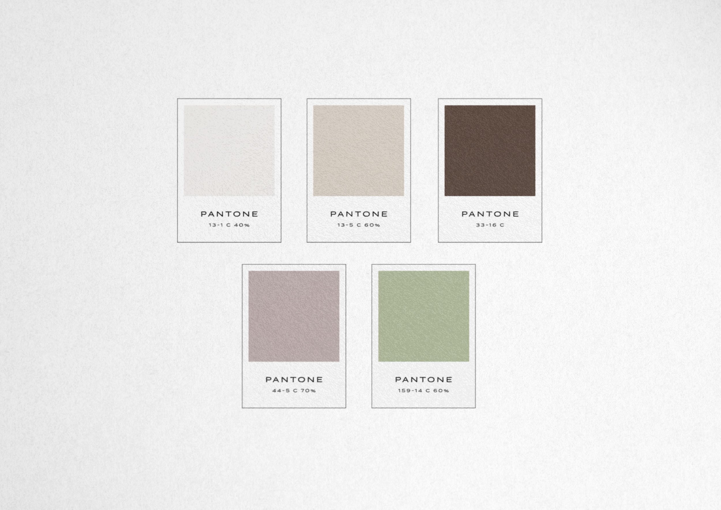
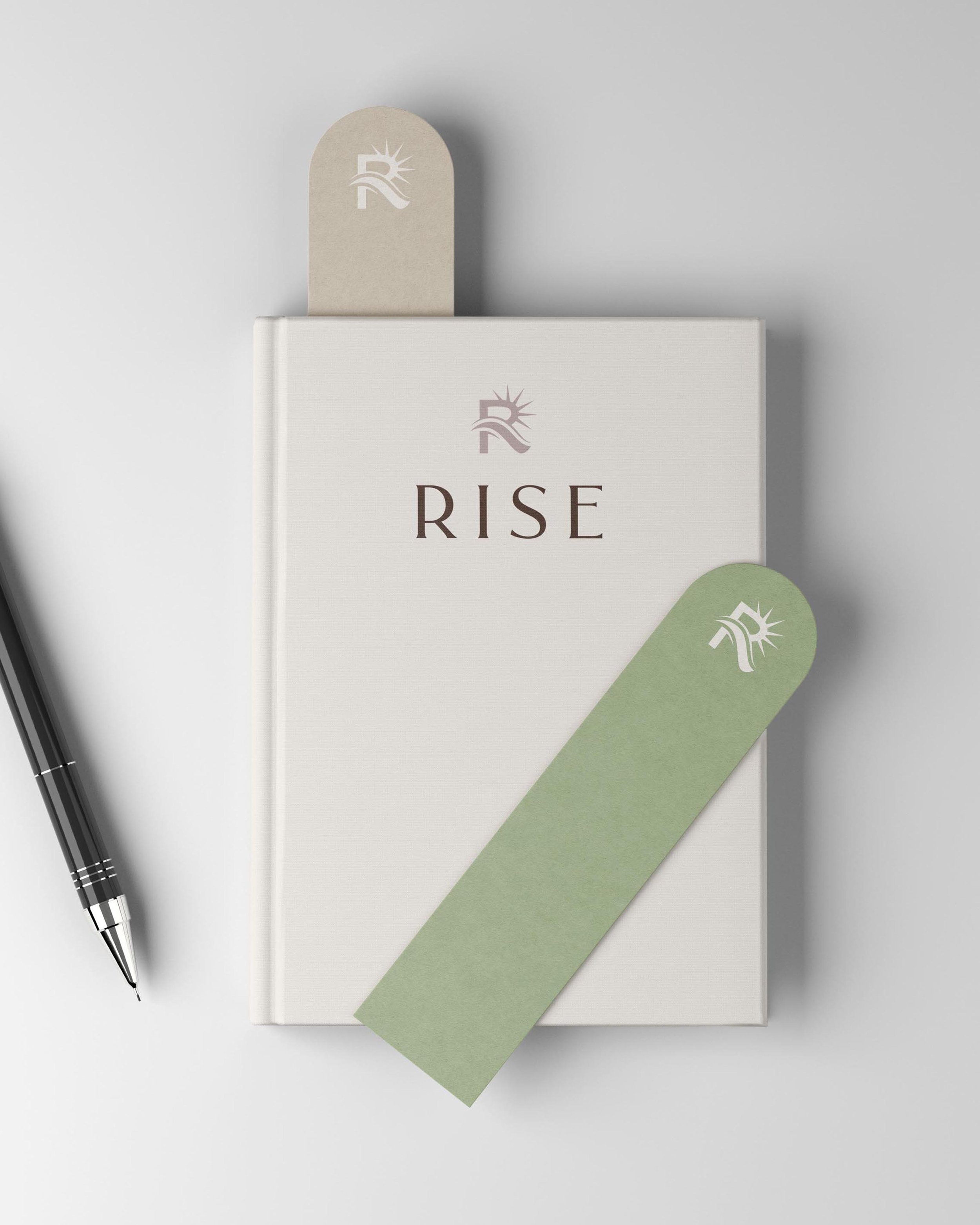
Do you want people to feel at ease? Our senior living concierge service client Rise Care Management wanted to bring peace and reassurance to the children of aging parents who were filled with worry about challenging life transitions. We translated this business goal into a unique brand color palette by working with a calming blend of colors. Based on the demographic that can afford these services, we also wanted to make sure it felt elegant and elevated.
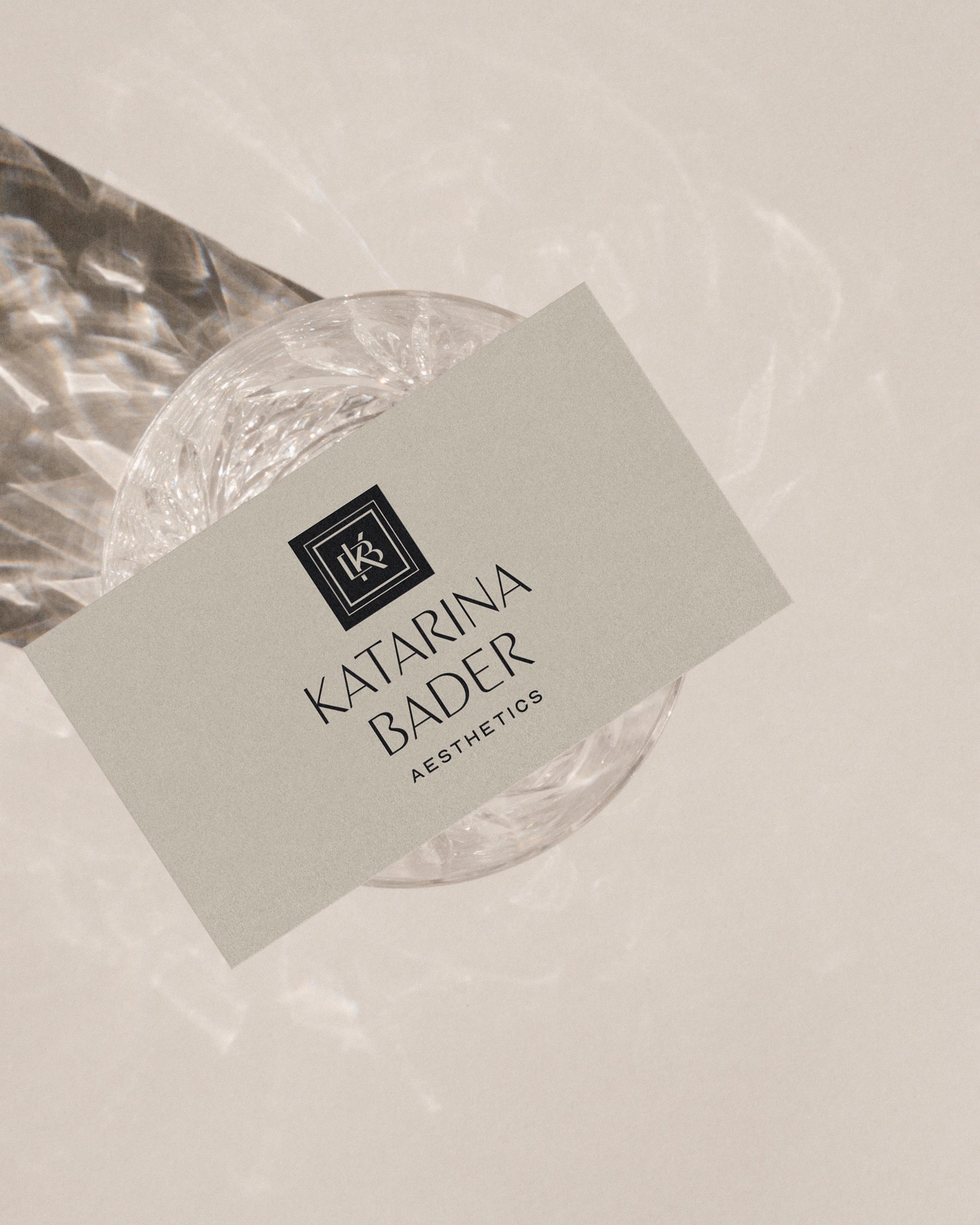
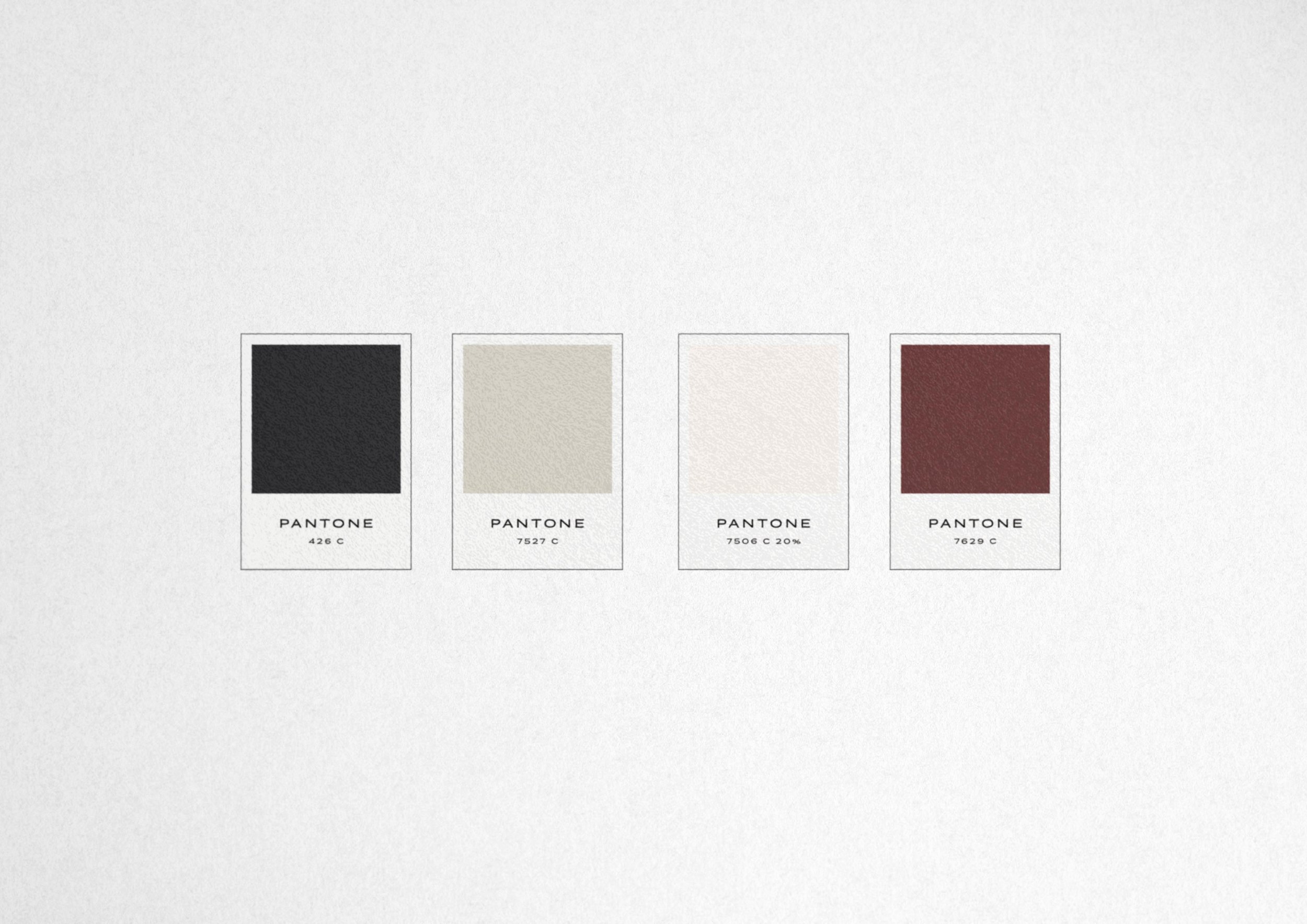
Do you want people to feel exclusivity? If your brand is ultra-premium like Katarina Bader, a top medspa injector trainer based out of Arizona, then the brand color palette should feel expert, high-end, and luxurious. By scaling back the color palette to be primarily black and white, this brand color made a statement.
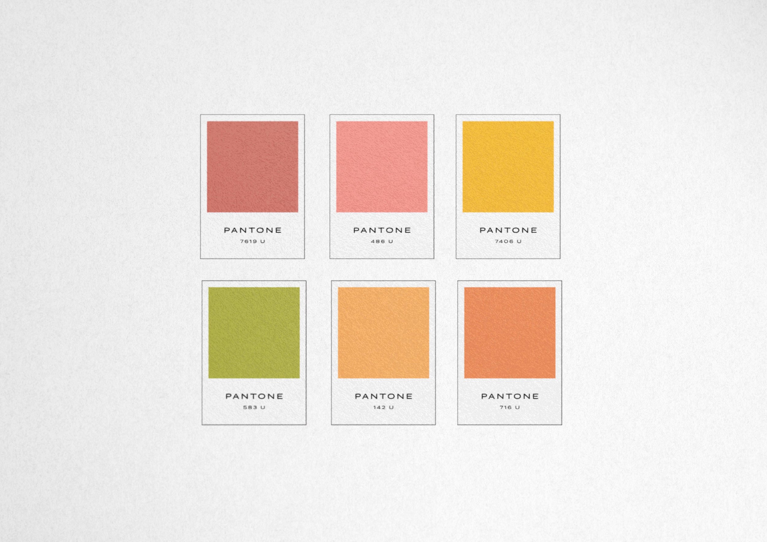
Do you want people to feel energized? If your brand is upbeat and infectious like Fresh Life Marketing, a coach and marketing consultant, then the brand colors should feel joyful, bright, and fun. We grounded the diverse and peppy color palette with a warm undertone background color that tied everything together for our client.
Color theory for a pleasing palette
You can select brand colors based on monochromatic, complementary, or analogous schemes. Whatever method you go for combining colors in your palette, your business needs balanced swatches for the color scheme to be pleasing to the eye.
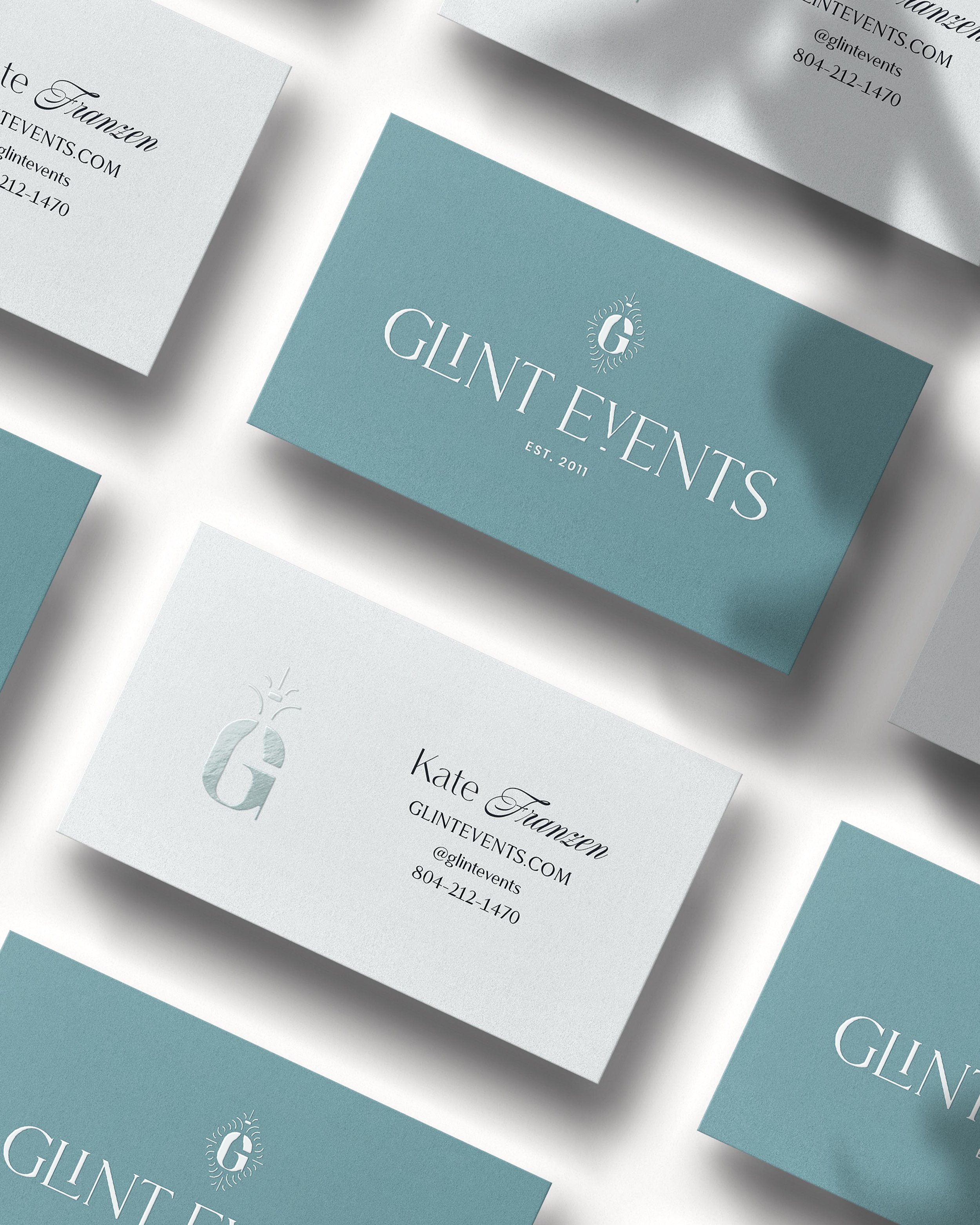
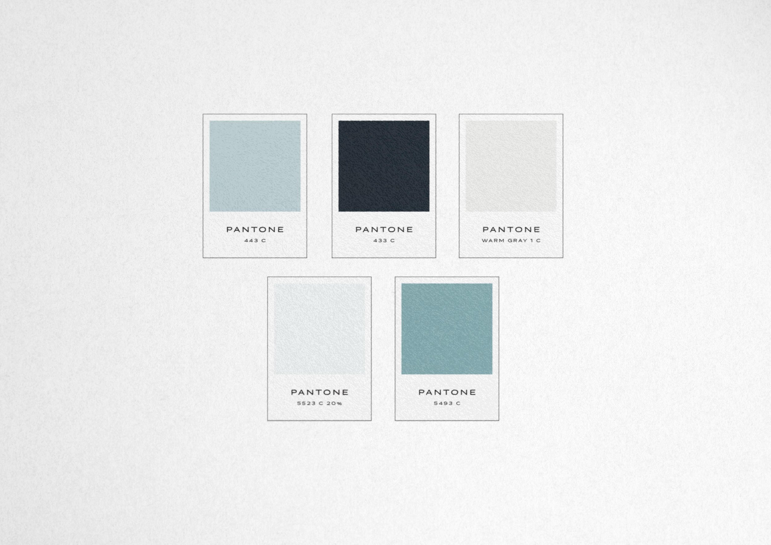
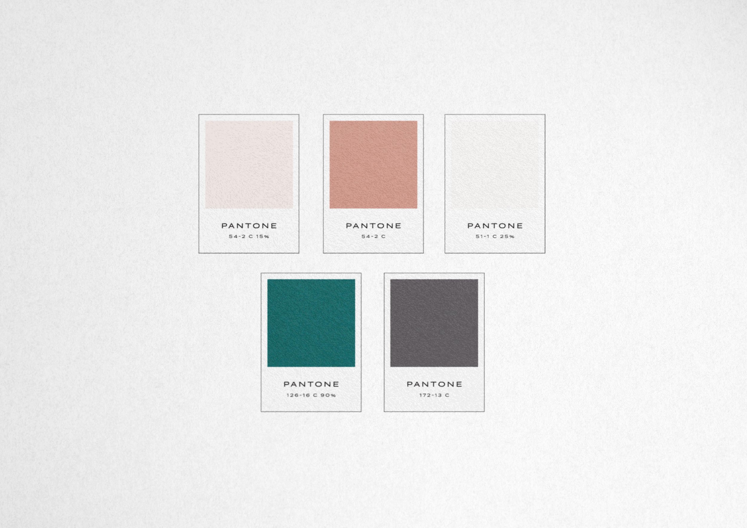
Monochromatic — Here’s an example of a brand we created for our client Glint Events in the wedding industry that makes effective use of one memorable brand color. To add harmony and make it more versatile, we took that main brand color and added in tints of the color.
Complementary — Remember the color wheel in school? For this approach, you can pair colors that are opposite on the color wheel. If you are set on a main color, looking opposite on the color wheel is a great way to pair two colors together that pop!
Analogous colors — For this method of pairing two colors that look good together, you pick colors that are next to each other on the color wheel. Once you have your main brand color, this is a good way to pair colors in a softer, related approach.
Color palette for website design
Color use on websites brings up some important considerations with user experience, legibility, and marketing that just aren’t a factor in color use in other places, like for instance your physical products. There’s a lot to consider with color on websites to make sure you get the conversion results you are looking for (or to make sure people even stay on your site for long enough without exiting immediately for that matter!). One of the most common branding color mistakes we see is businesses selecting palettes that are beautiful but not usable.
First, a few quick definitions of color. (We promise, this is useful for your site!)
Colors are defined by:
Saturation: how vibrant or grayscale they are
Value: how dark they are
Temperature: how warm or cool they are
Website Colors: Support and complement your images
If you have product or service images with a dark, moody, and desaturated feel, your brand colors will need to complement that and be selected based on the right saturation. If you pair it with light pastels or bright neons, it will look off because the saturation (vibrancy) is out of sync.
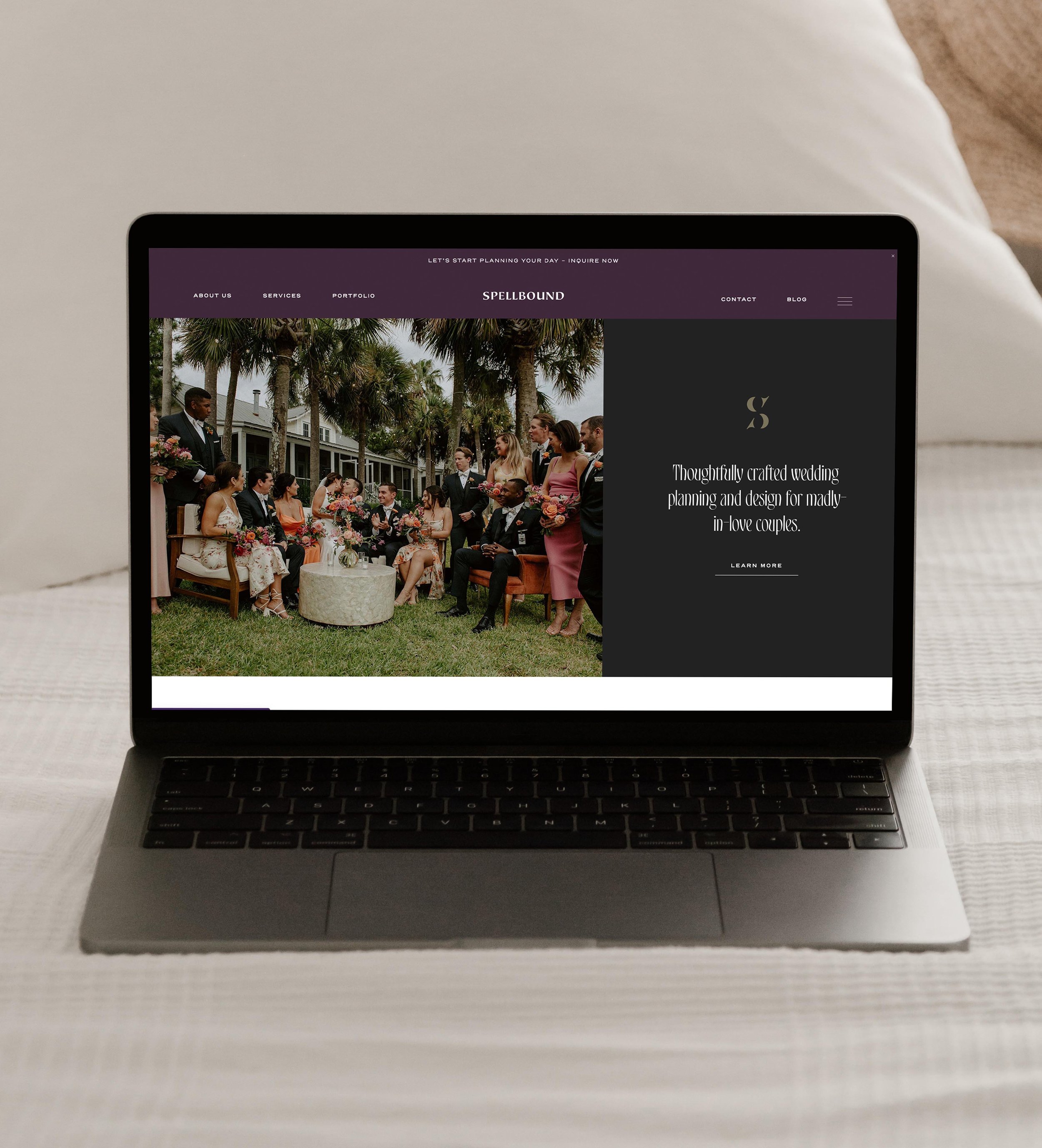
See how we paired the moody images of our client Spellbound Events in the event industry with appropriate colors.
When narrowing in on your brand colors, your images for your site don’t have to be the source of your palette, but they do need to complement them not clash.
Website colors: Legibility and contrast
When picking the value of the colors that will go on a website, it’s also important that you have a mix of dark and light tones. You will need a dark enough color for text, a light enough background fill color that has legible dark text over it, and a mid-tone fill color that is dark enough that white text on it is readable.
Let’s see how this color palette plays out in website applications to show you what we mean!
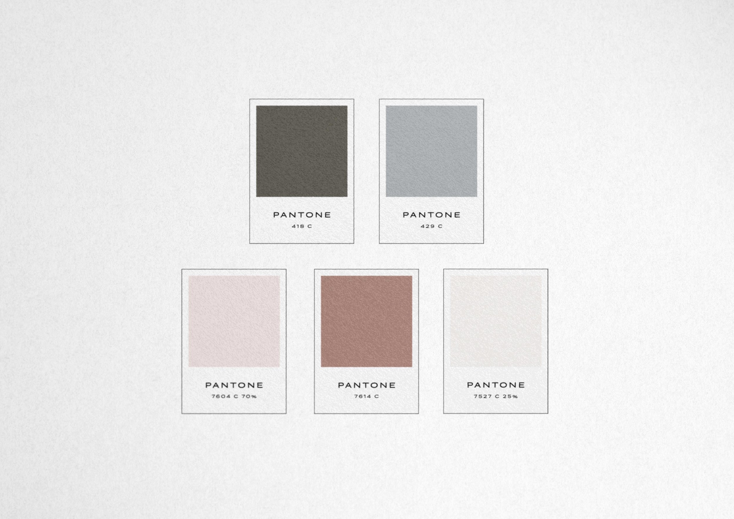
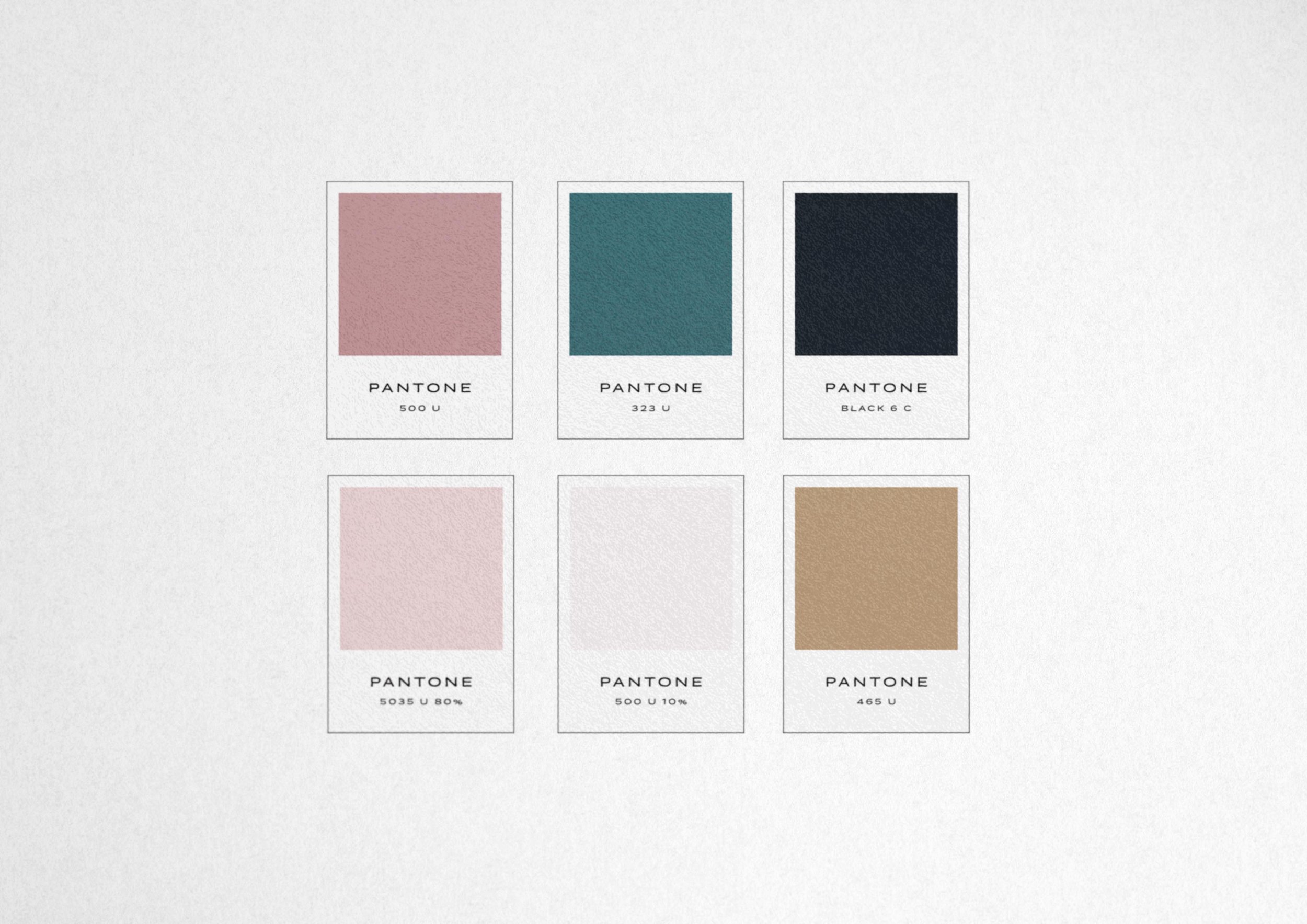
On Feather & Bloom’s website, we use Pantone 418 C as the text color for the headline and body copy. It’s dark enough to be easy to read on a variety of devices and screen displays. Even though we may have seen lighter colors in the moodboard we curated to set the tone for the color palette, we needed to make sure we recommended a color that was dark enough to work well for text. After all, the primary goal of a website is to be read and persuade your buyers!
The result is that we curated not only a lovely palette for our client’s website but also a legible one!
Website colors: Warmth and on-screen variability
One reason why websites are an important consideration for brand colors is screens variably display colors. Just take a swipe at the brightness display on your smartphone and play around with viewing a website on different levels. All screens and the lighting they are viewed in can affect color. For your site, while a light yellow may look beautiful in the physical world, a light, neon pigment on a screen can be almost invisible!
Colors can also take on a different temperature (warmth or coolness) depending on the screen as well. It’s good to keep in mind that your website won’t show colors 100% true, and make sure your colors are not an extreme temperature on either end of the spectrum.
Make sure you’re working with colors that will work on a variety of screens and still be visible.
Sales-driven brand colors
Any colors can be deployed on an effective sales page or advertisement. Studies have shown that certain colors can create more urgency and increase click through rates. While that doesn’t mean you need to bring in a traditional sales color like red, which might feel overpowering to your brand aesthetic, it does mean thinking about a color palette that is diverse enough to include a color that can act as a highlight color or button color to help draw attention.
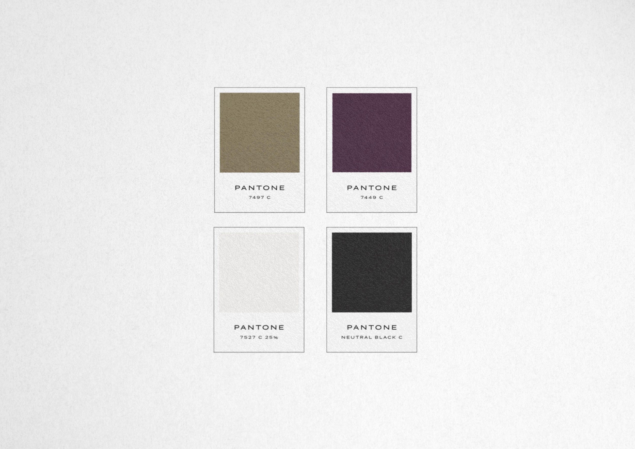
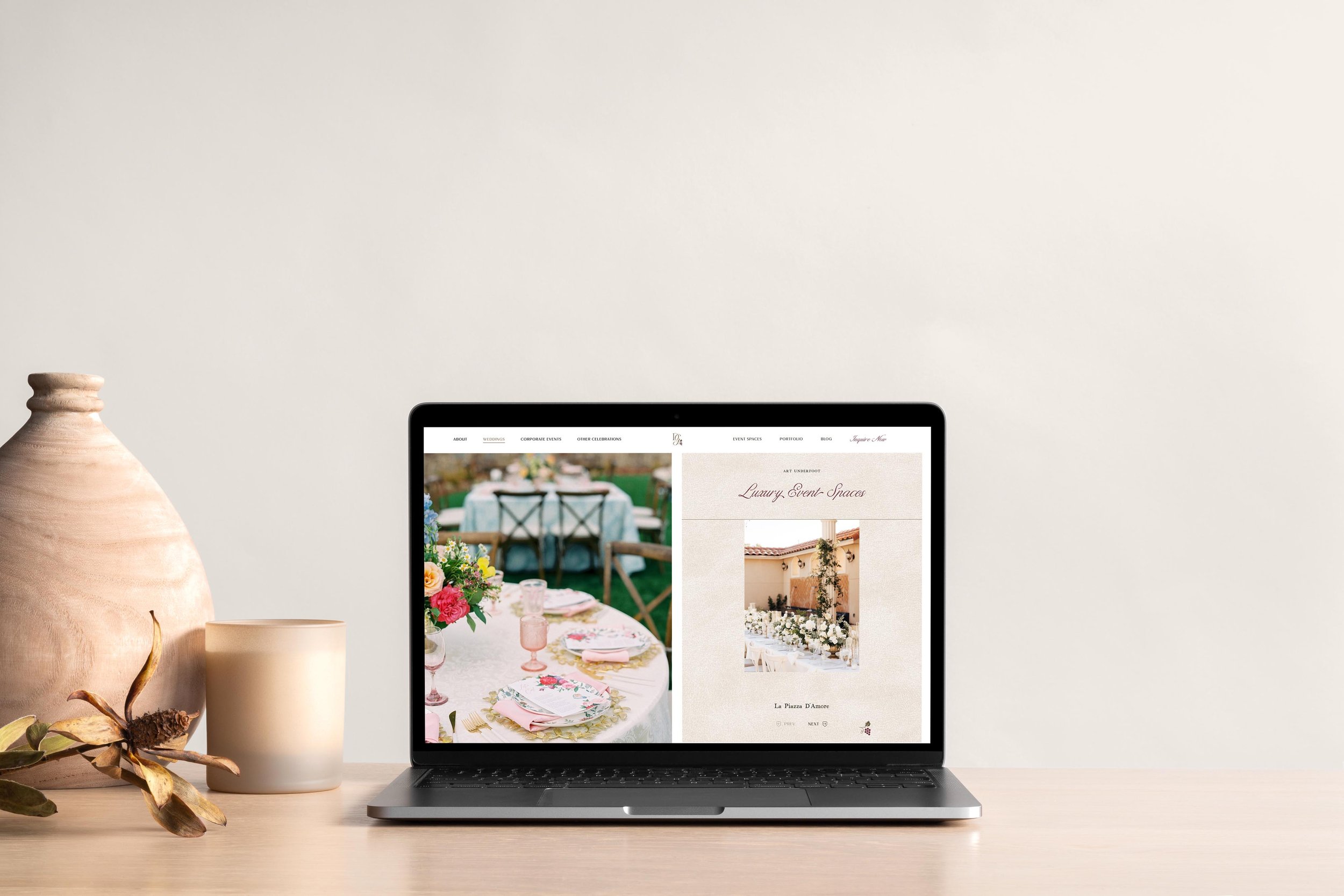
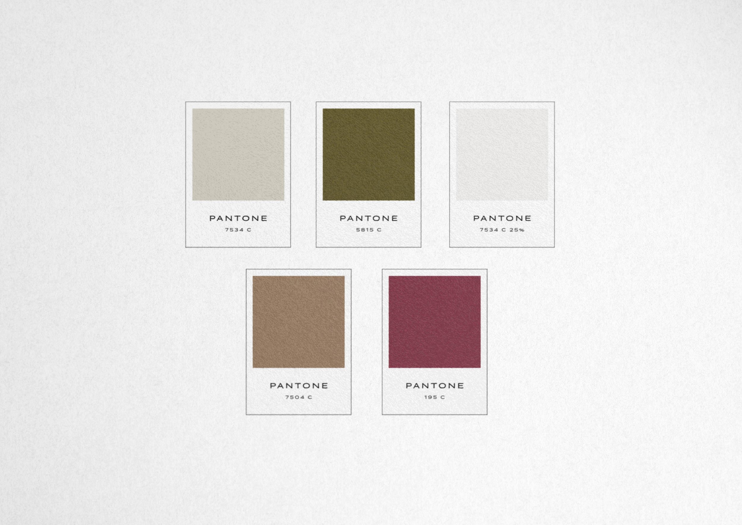
For your brand, that focal point sales color might be a rich tone like we did for our client D’Vine Grace, a wedding venue in Texas. We used olive as the neutral in their sales materials but accented it with a plum/burgundy shade to be used as an accent to draw the eye and attention.
Don’t feel the pressure to fit into rigid color theory or sales color cliches. The more you can sell within your brand world and a consistent color palette, the more impact you’ll have.
Now that you’ve summed up those four color factors for your business, we want to factor in your existing products and existing storefront in your color selection. Here’s how to do that!
Physical office or storefront space
Sometimes clients come to us who already have an existing office space, medical practice, or retail store that already has colors in use that we need to make sure we complement. There may be colors you can’t entirely change in your buildout, and we want to create synergy between your physical and online space.
Make sure you select brand colors that complement your existing storefront space or medical practice office interior if it cannot all be easily or entirely changed.
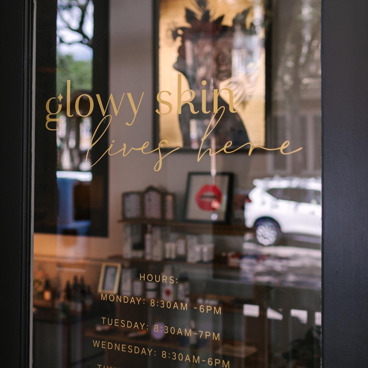
When we worked with Gainesville, Florida-based medspa, Glowbar GNV, our client was planning her buildout. We took a look at the exterior of the complex her office was part of and made sure the color scheme we were working with for the brand would fit within the HOA guidelines for exterior signage, and also enjoyed getting more creative with colors for the interior space.
Existing product line
Another thing to consider is if you are refreshing the brand of your business and you are working with an established line of products that won’t all be changing. Make sure that your existing product line will shine alongside the new brand colors you pick.
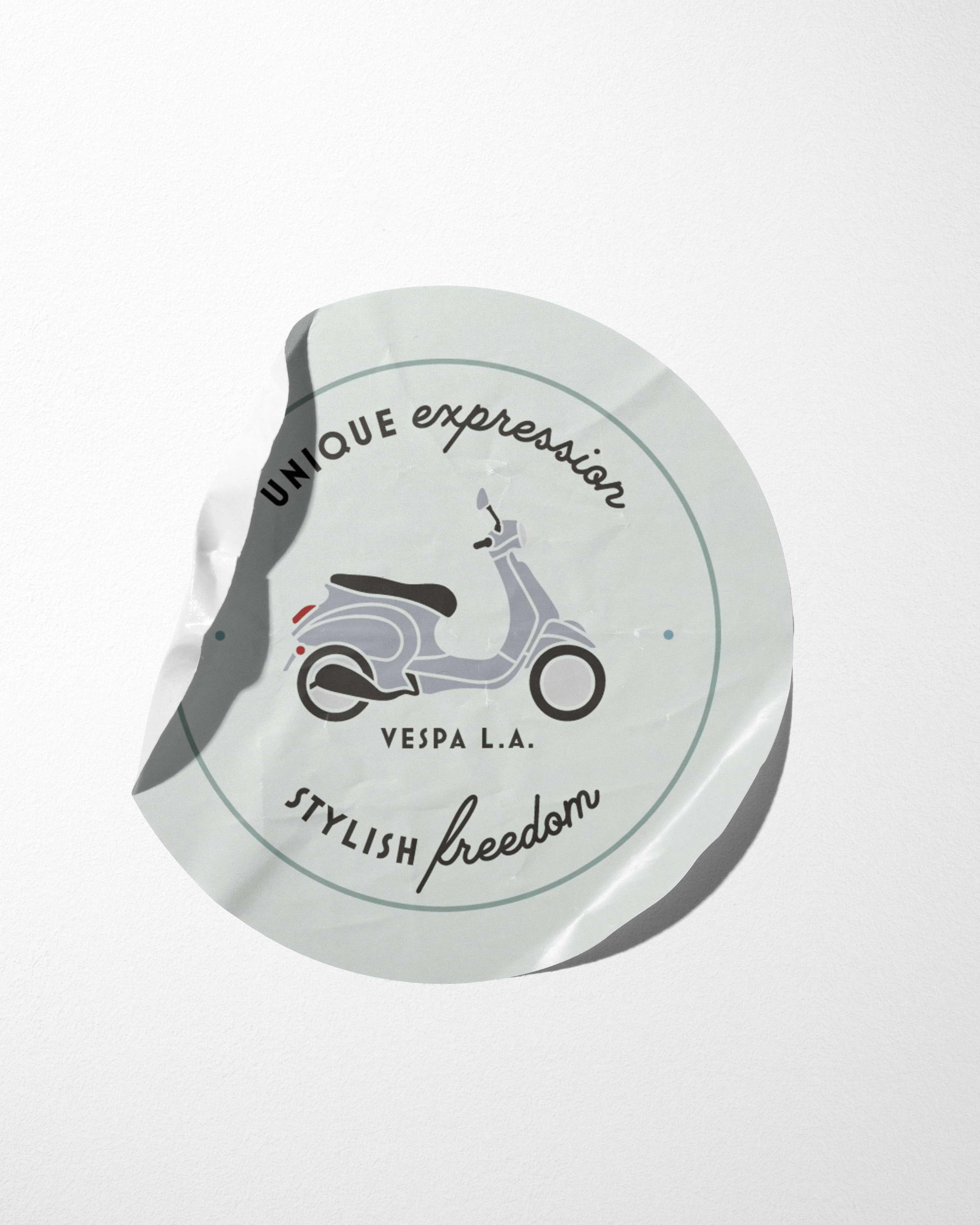
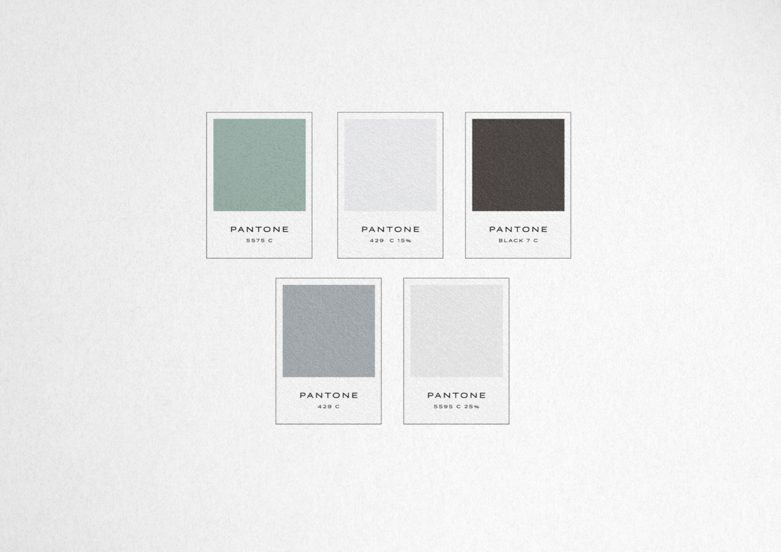
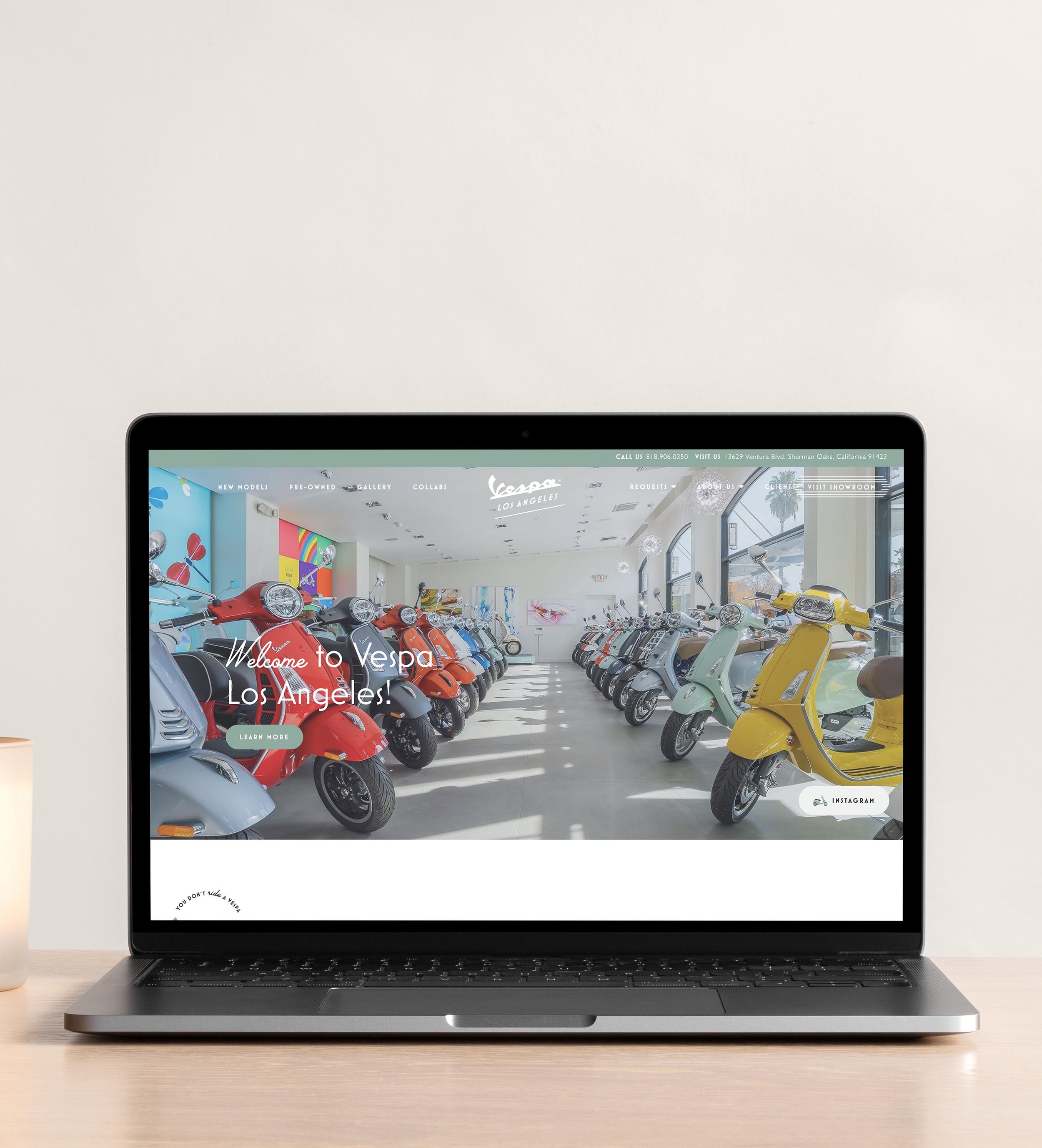
This is exactly what we did for our client Vespa Los Angeles. Their showroom location was filled with a beautiful, bright rainbow of motorsport bikes. We wanted to make sure that the colors we picked supported those and didn’t compete with them. These colors were ultimately used on a swag, like buttons and apparel in their store, not to mention on the website framing up photos of these bikes, so it needed to flow together without taking away from the bikes themselves.
The final step is to consider your future goals and make sure your color scheme will be able to multiply and grow as your business does. Let's plan a custom brand color palette for future product expansion. Here’s how!
Future product expansion
While no one can predict the future, you may know right now that you will be adding more offers or products to the mix down the road. Will your brand colors work or give you enough options for adding in a variety of new packaging and label designs in the future? Even if you are a service-based business, you’ll want to have a color palette that can support the delineation across multiple packages and ways to work with you down the road as you expand. Curate your colors with product expansion and growth in mind.
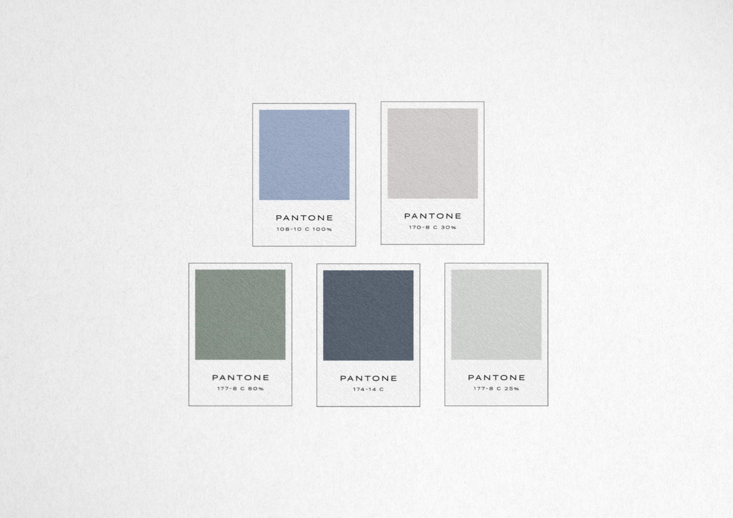
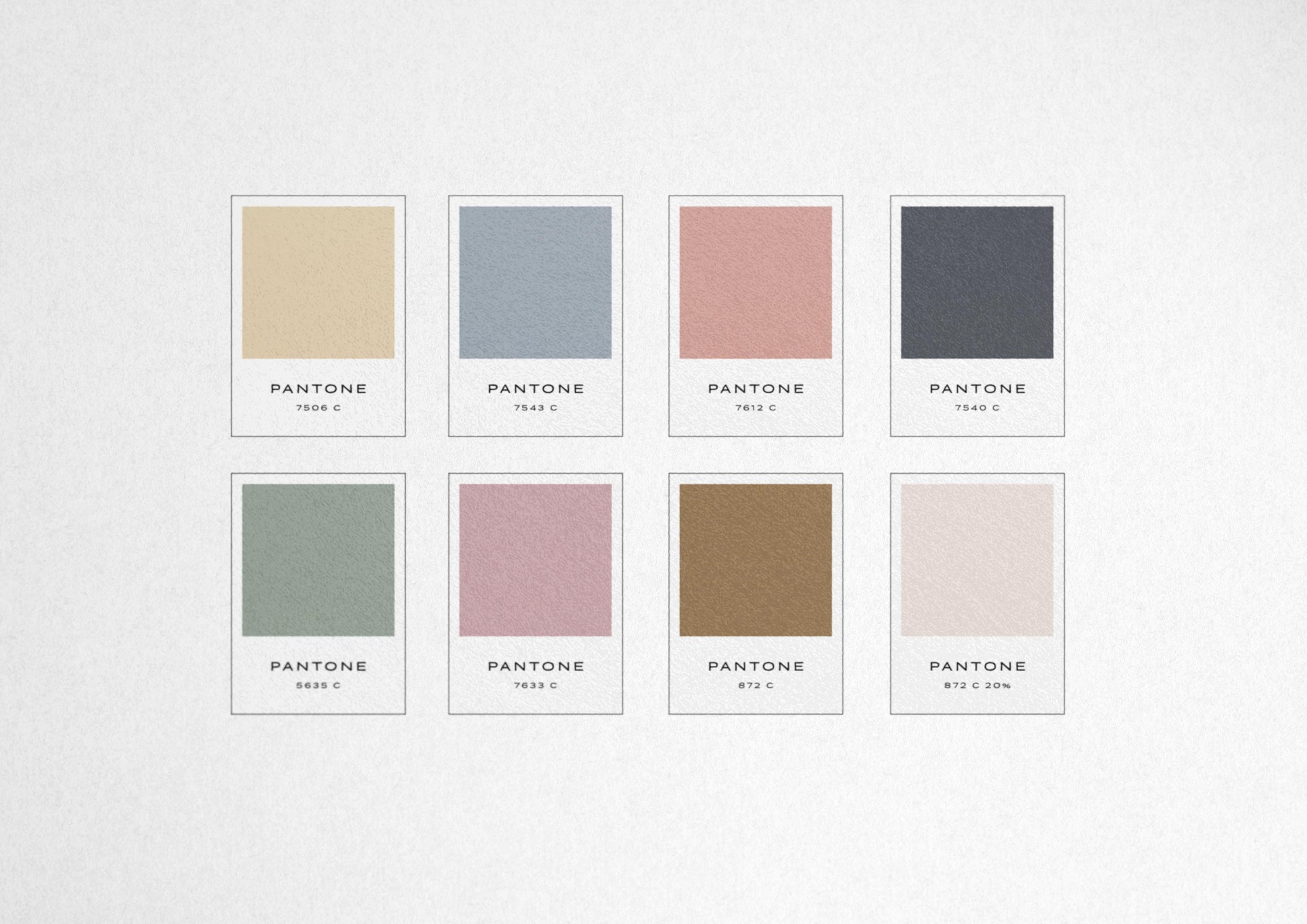
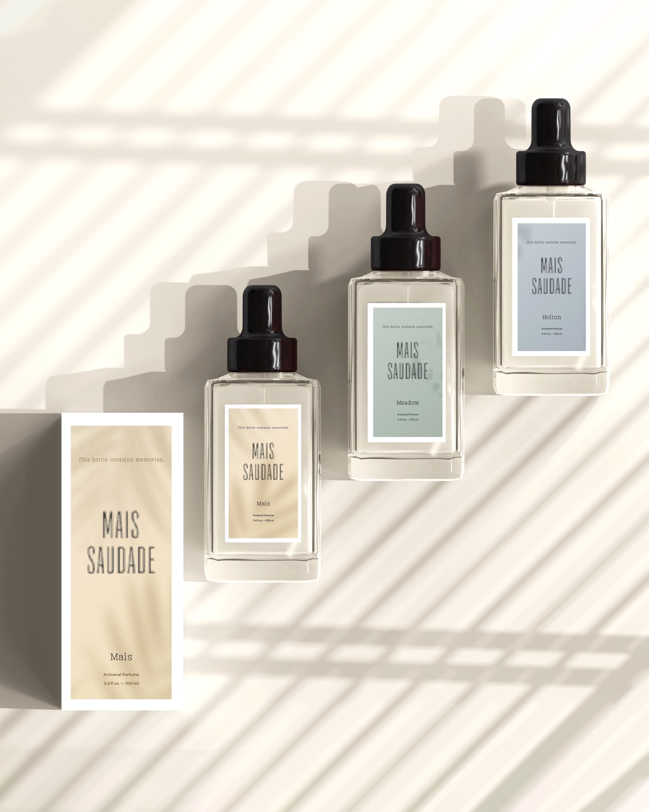
When our fragrance client Mais Saudade came to us, she had formulas underway for several signature perfumes as well as awareness that she would be adding more scents to her roster in the years ahead. When we developed her brand color palette, we wanted to make sure we could layer in additional product colors and have it work alongside the fixed brand color palette. Because of this, the brand color palette is united by a similar color family feel, and we can add in different hues that fit this family in the future no matter what scent she invents!
So, we’ve added up 7 considerations for your brand colors. When you put all this together, you can feel confident to establish your unique brand color palette.
We hope this formula has gotten your creative juices flowing as to what hues will work best for your business (and how to use them!)
Your Brand Palette
While we think it’s helpful to share our color process as a formula, it’s not all math.
There’s an art to picking the right colors for your brand, and that’s why our team brings together 25+ years of combined experience to recommend the perfect palette that will set your brand apart! Want to see exactly how our brand strategy and design process builds in color selection and at what stage in the process we do this? Check out our branding and logo process to learn all about each step of our creative process.
Let’s discuss your unique color palette needs! Book a free consult.
We want to help you stand out and be remembered with a timeless, custom-crafted brand. During our custom branding process, we hone in on a color palette to best represent you and serve your unique needs. After branding, you have the option to continue working with us on your website plan and build, as well as a variety of graphics, templates, signage, and collateral.


