Aux Baseball Brand Design
Aux Baseball was founded by Jamie Schultz, a former Dodger and Ray, who’s now bringing supplemental support to baseball players, coaches, and parents through specialized programs and education. What stood out most in working on the Aux brand was Jamie’s love of baseball—not just as a sport, but as a life-long passion. So, when approaching the Aux Baseball brand design, our goal was to celebrate baseball in a classic, timeless way.
About the Aux Baseball Brand
Aux Baseball provides programs, education, and consulting to support to baseball players, coaches, and parents. Whether it’s helping a young player refine their skills, guiding parents through the recruitment process, or equipping coaches with better tools, Aux is all about elevating the game at every level.
Step One: The Aux Baseball Brand Strategy & Synthesis
An Athletic Brand Strategy
Before diving into any visuals, we got clear on the Aux Baseball brand strategy—defining the company’s mission, ethos, target audience, etc. This meant distilling Jamie’s deep passion for baseball into a cohesive brand direction that resonates with players, parents, and coaches. By focusing on the sport’s timeless qualities, we set the foundation for a brand that feels both classic and fresh.
Refined mission statement and tagline
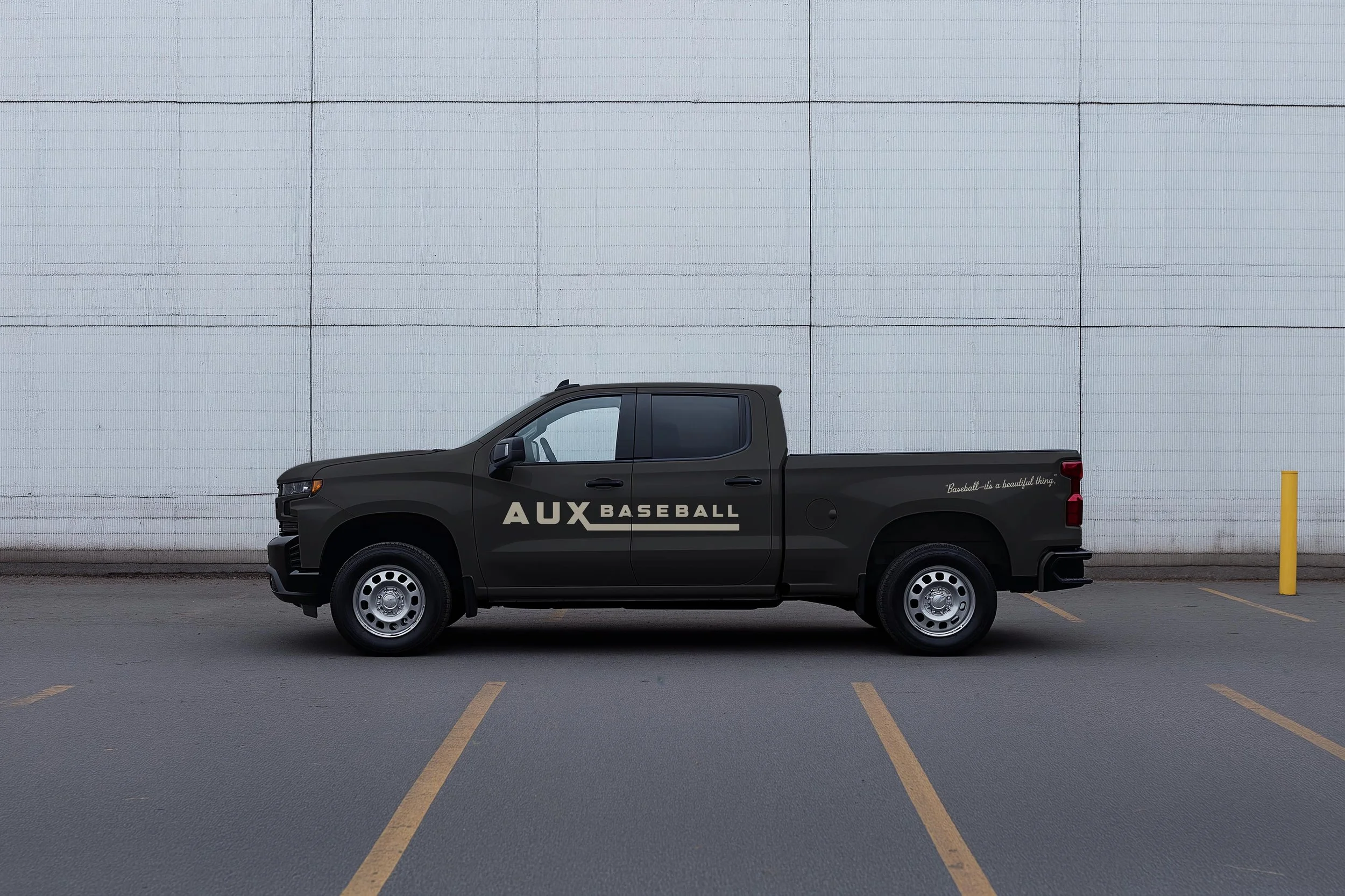
We worked closely with Jamie to home in on a brand mission statement and tagline that captured the heart behind Aux Baseball. One of our favorite details from the brand is that the tagline, “Baseball—it’s a beautiful thing,” actually comes from Jamie’s former little league coach—it’s how he signs off all his texts to this day.
Target audience
We got clear on the Aux Brand’s audience. To ensure the brand resonates, we defined three key archetypes that make up the Aux community:
Players: Bode is a hard-working high school sophomore who takes baseball seriously. He’s competitive but coachable. He loves following his favorite teams, wearing cool athletic gear, and spending time with teammates.
Parents: Jessica and Mike, Bode’s parents, are committed to supporting their son. They’re busy professionals with the means to invest in training, consulting, and travel teams but need expert guidance to navigate it all.
Coaches: Scott, Bode’s coach, has a strong baseball background but is looking for better tools to develop his players. He wants to incorporate analytics and structured programs to help his team improve as individuals and as a unit.
Brand objectives
Next up, we clearly outlined our goals for a brand that balances style, credibility, and a love for the game.
The logo needed to be something players genuinely wanted to wear—something with serious drip. It had to feel high-end and modern while still being trusted by parents and coaches. We wanted to celebrate baseball’s timeless qualities through thoughtful design choices, incorporating old-school lettering and inspiration while ensuring the brand felt fresh and adaptable. The brand needed to include memorable design elements that would make Aux stand out while staying true to its core values of warmth, integrity, and family.
To maintain this focus, we also outlined what to avoid: bright primary colors that might feel too juvenile, overly professional aesthetics that risked losing its sports identity, and anything in the arena of a summer camp logo. Additionally, we wanted to stay away from cliché baseball imagery like bats, balls, or stitches, to ensure Aux has a fresh presence in the baseball world.
Step Two: The Aux Baseball Brand Design
Once we established the foundational brand strategy, we moved onto visuals. We curated a moodboard and started sketching logo concepts and playing with colors and typography to capture the Aux vibe.
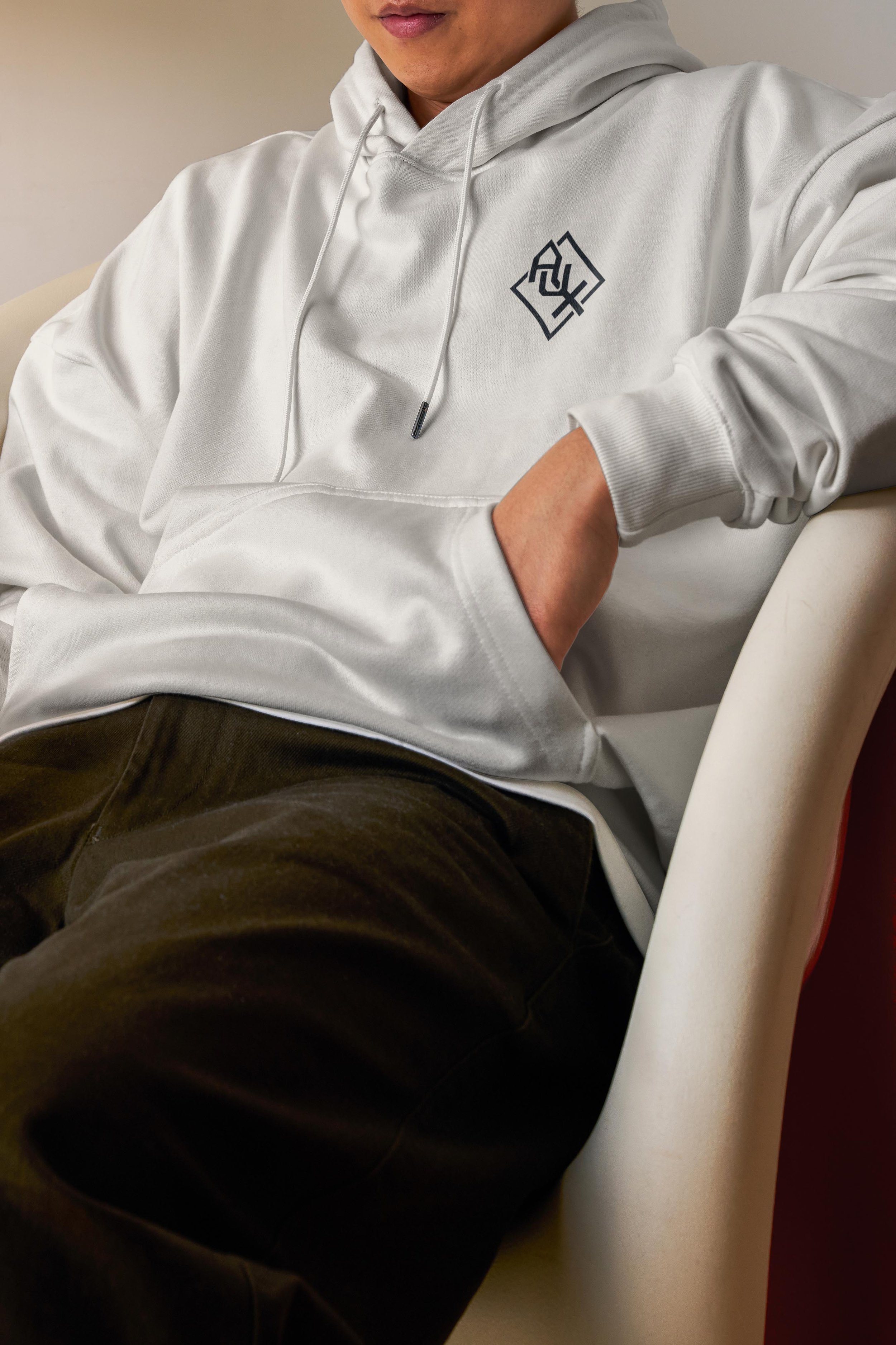
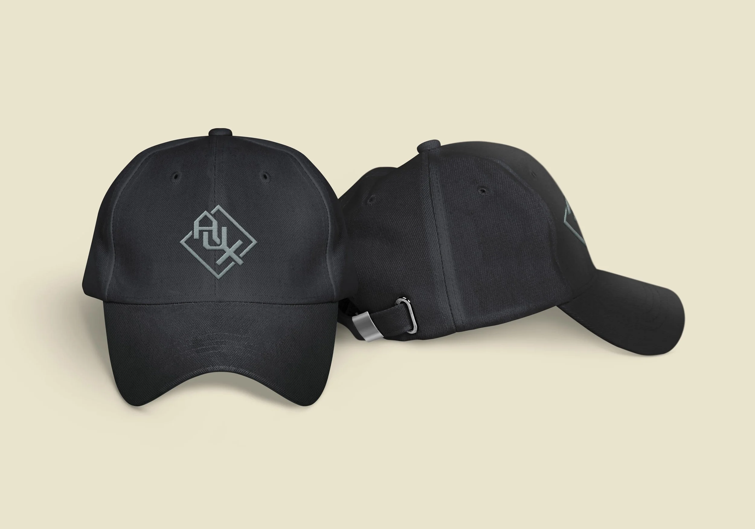
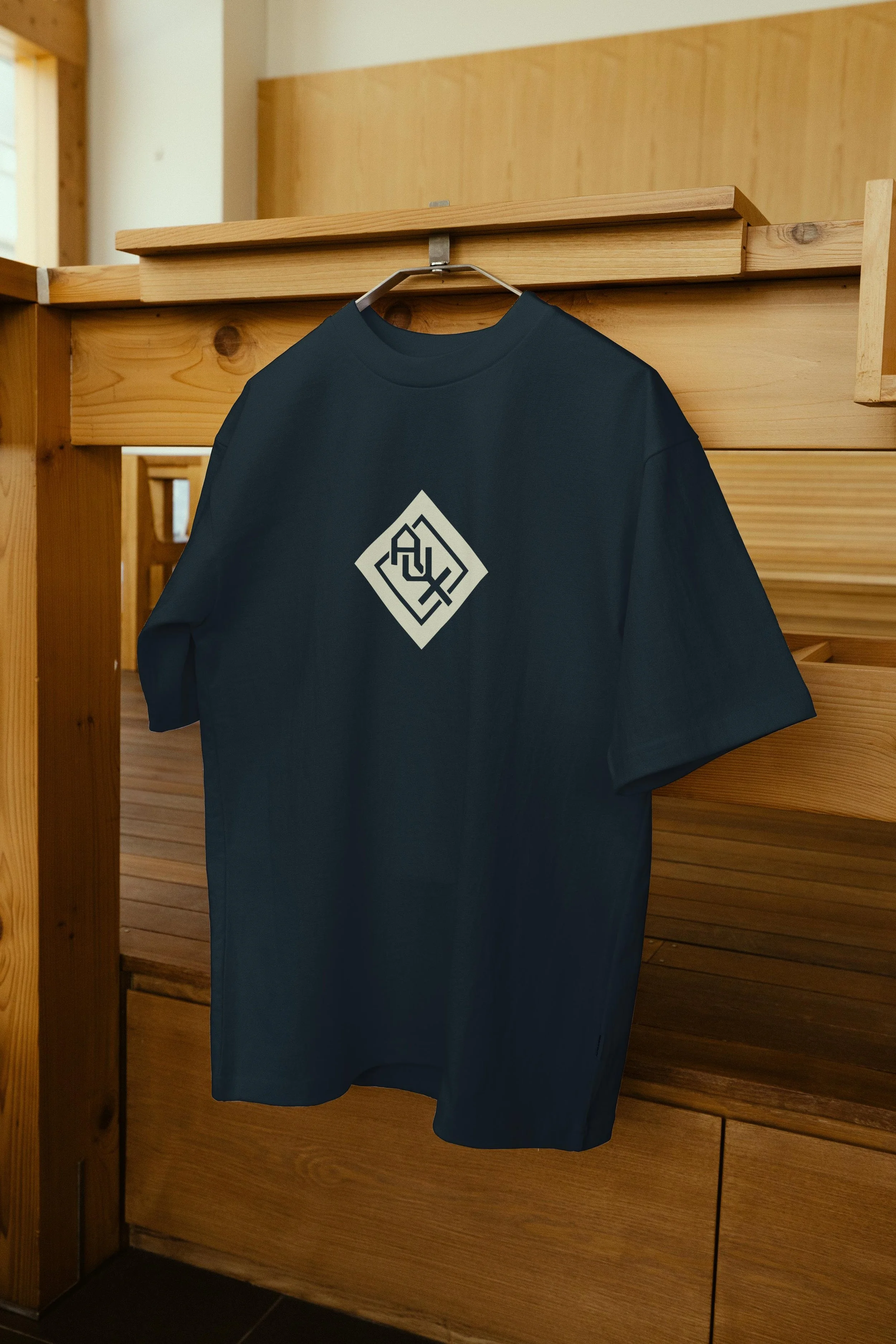
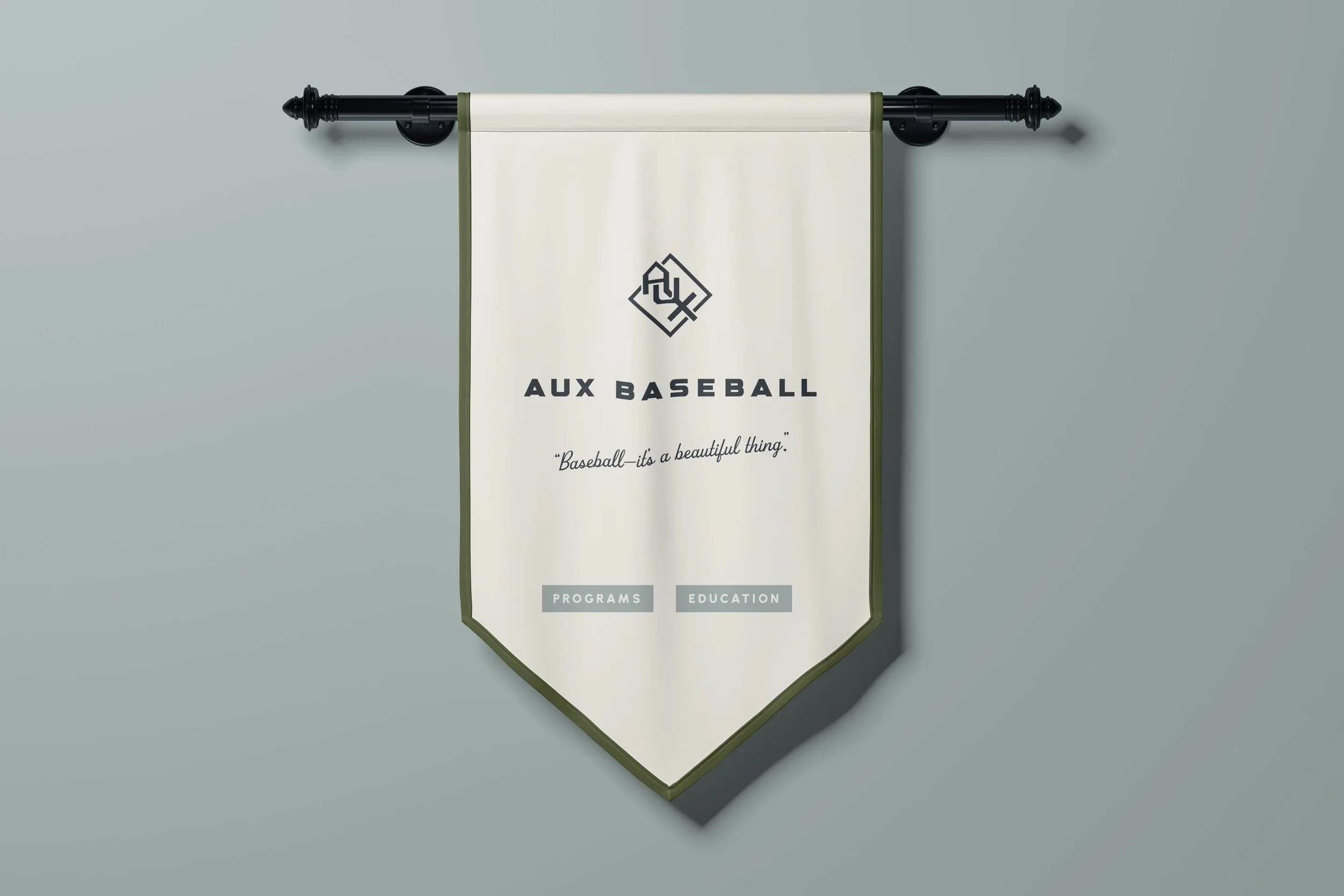
A classic, custom baseball logo design
We landed on a final logo concept that’s built on iconic baseball elements to celebrate the love for the game—executed in a way that feels classic, not cheesy:
Home Plate: A hidden home plate represents the heart of the game and the runs—both literal and symbolic—that Aux helps players achieve.
Baseball Diamond: The mark is subtly grounded in a baseball diamond shape, reinforcing the love of the game. As a fun nod, the shape also pays tribute to Jamie’s former MLB team, the Tampa Bay Rays.
Color Palette
We chose a color scheme that feels classic, athletic, and elevated, avoiding anything too bright or juvenile while still being appropriate for an athletic brand.
Typography
We selected a mix of typography to capture the Aux personality. The display font, Grecko, gives the brand an athletic feel without overdoing it. We brought in a supporting sans serif, Urbanist, to balance the look and add a subtle retro touch. For a fun touch, we set the tagline in a nostalgic slanted script to reinforce the classic baseball aesthetic.
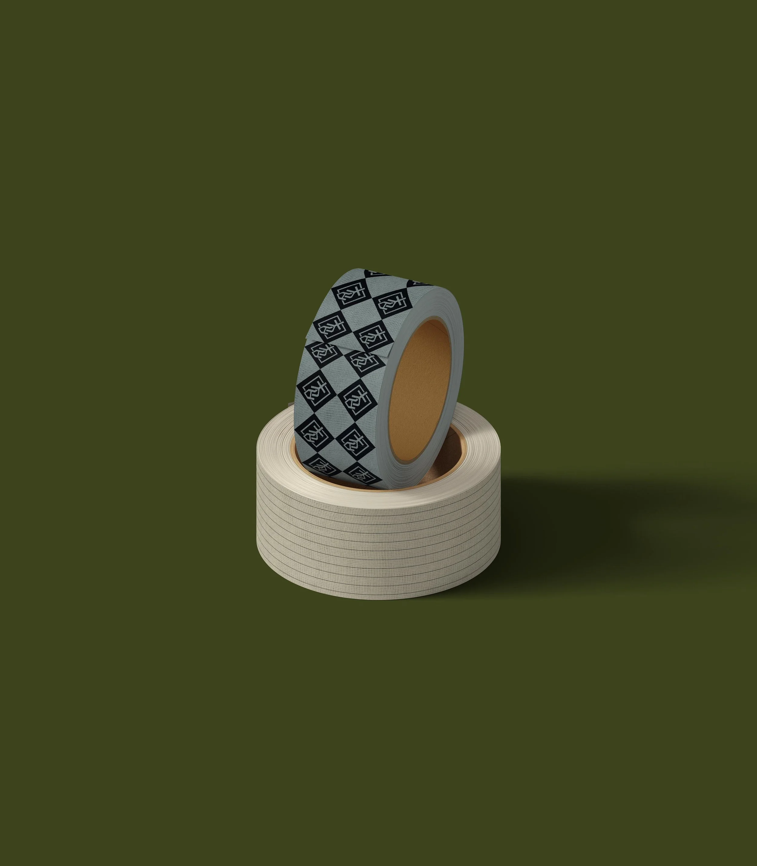
Patterns
To further tie in baseball’s heritage, we introduced a classic pinstripe pattern that will add extra dimension and personality to their website, social media posts, and swag.
The Final Result: A Timeless Baseball Brand Design
The Aux Baseball brand is a beautiful blend of tradition and modernity—just like baseball itself. With a logo that pays tribute to the most iconic elements of baseball, an elevated yet approachable feel, and a tagline that speaks to the love of the game, Aux Baseball is ready to empower the next generation of players, parents, and coaches.
See the brand in action @auxbaseball

Custom Branding
Our studio has an artisanal approach to give you strategic solutions. Every logo starts in pencil. The end result is a brand you’ll leverage for years to come. Schedule a free call with our creative director, Kathryn Joachim, to discuss your branding goals.